The Hometown Remix jerseys aren't out yet, but I can already tell how this grades. About half the league is getting something that could only belong to its city. The other half is getting a recolored template with a hometown-pride press release stapled on. That's what happens when Fanatics runs a civic-identity program as a merchandising exercise.
As of October 19, nothing is official yet. The NHL and Fanatics confirmed the program on August 19, but that was only a logo and a scope: black and neon green, a spray-paint "REMIX" wordmark with an arrow curling off the last letter, no actual jerseys. The full unveiling of all 32 designs is expected in the first week of November, with Florida debuting its set on November 2 and Nashville and Toronto both pegged for November 7. Everything below comes from leaks.
The league set the bar itself. These uniforms, it says, will "uniquely and authentically celebrate the fans, city and local culture of each team." Fine. Hold them to exactly that.
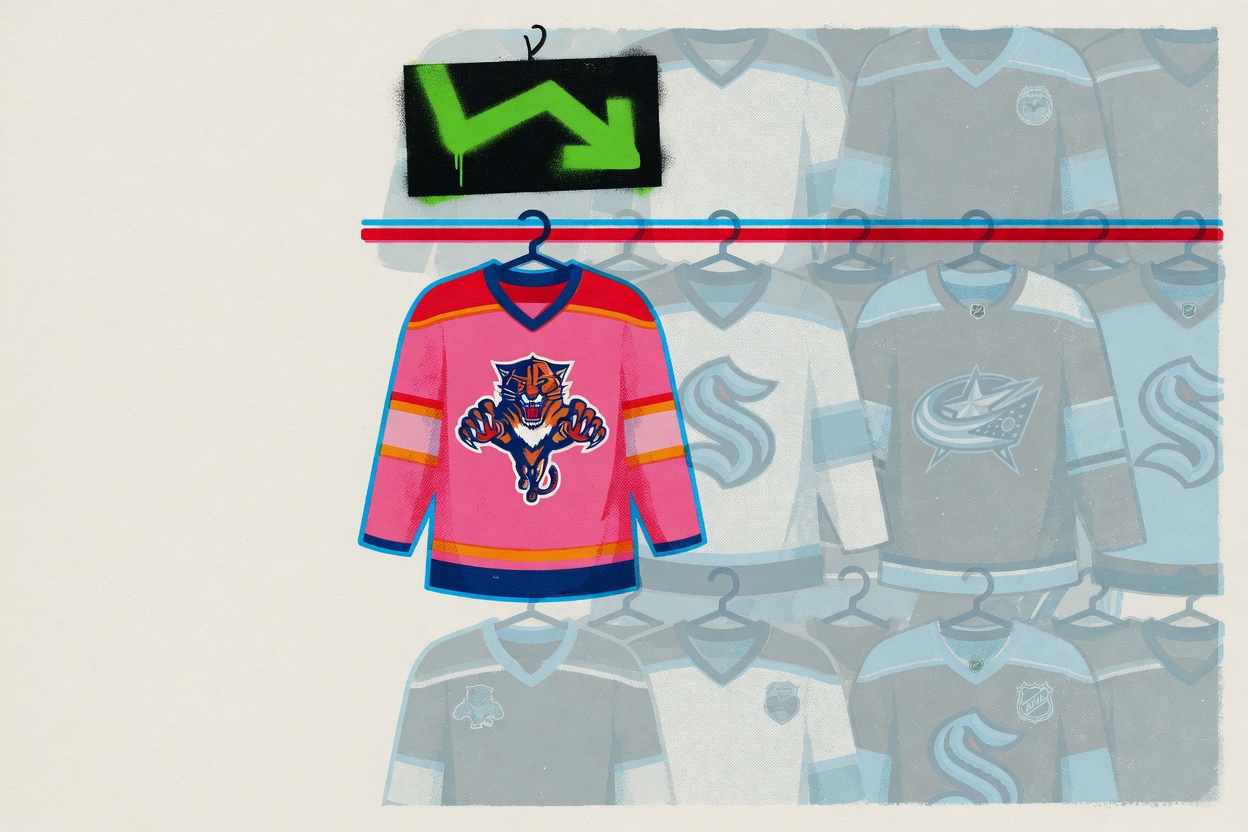
When it works, it works. Florida's reported pink jersey, with orange, yellow and navy accents, is described as the first time any NHL team has gone pink, and it's unmistakably one place. Montreal pulling civic symbols off the City of Montreal's flag onto the sleeves is the kind of rooted, specific choice the whole thing is supposed to produce. Nashville tying its remix to Dolly Parton is a statement no other market could claim. You know exactly where you are with those. Love them or hate them, someone made a decision.
Then there's Columbus. The leaks have the Blue Jackets built on grey, which one tracker called "not very Blue Jackety," and that's being kind. Columbus has spent its entire existence fighting the sense that it doesn't have a clear look. You don't fix that with a neutral base color and the city name underneath it. That's a blank.
The program has real hits too. Washington's reported version, drawing on the blue of its vintage Screaming Eagle sweater, sounds like it has real juice. Toronto leans hard on the team's 1927 St. Pats history, with a logo echoing a simple green leaf and Toronto beneath it, which is a genuine Toronto story even as it blurs the line between hometown tribute and anniversary throwback. The good ones are good.
But look at the pattern in the weak ones. Grey for Columbus. Reports of a similarly neutral palette for Seattle, though the exact color hasn't been pinned down. A trendy neutral slate managed across the whole league so the merch wall reads coherent in a Fanatics store. That's the tell. This is the first league-wide special-edition program designed entirely by Fanatics since it took over from Adidas in 2024, and the company built it straight off the MLB City Connect and NBA City Edition playbook: programs ripped for years for recycling the same handful of moves across cities with nothing in common. A trendy neutral base, a skyline, one cultural Easter egg, ship it.
Reverse Retro at least had a spine. It was old jerseys with inverted colors, the third league-wide special edition since the pandemic after Reverse Retro and Reverse Retro 2.0, and you could verify the nostalgia. Hometown Remix asks for something harder, an actual argument about what a city is, and roughly half the time the answer coming back is a neutral swatch.
If this lands as a coin flip, and the leaks say it will, the blame doesn't belong to the designers who clearly fought for the Floridas and the Montreals. It sits with Fanatics' design leadership and the NHL marketing department, fronted by EVP Brian Jennings, who signed off on selling a palette and calling it civic pride. A program that promises to authentically celebrate 32 cities and hands a chunk of them a color swatch has just restocked the shelf.