Give the PWHL's design people a bonus for Detroit and Hamilton, then sit the Vegas group down for a talk. The league unveiled names and logos for its four expansion teams on November 10: the Detroit Clutch, Hamilton Havoc, San Jose Sea Lions and Vegas Vanguards, all bound for the 2026-27 season. Two of these belong only to their cities. The third could be stamped on any franchise in any league.
Start with the best, which happens to be the one getting the most grief. The Detroit Clutch is a triple play. It's a car part, in a city built by the auto industry. It's a hockey word for delivering under pressure. The logo folds in a Motown tribute too, with rhythmic vinyl lines curled inside a wheel, the whole wordmark done in chrome, Art Deco type. Call it generic if you want, but a generic name doesn't do three jobs at once and tie every one of them back to the same town. Somebody actually learned something about Detroit before they opened the design software.
Hamilton Havoc pulls the same move. The name reaches for the city's industrial grit, and the logo puts the peregrine falcon, Hamilton's official bird, perched on steel-forged lettering. You can quibble that a falcon and the word Havoc don't obviously belong in the same sentence, and people have. I don't care. It's specific, with real roots: steel mills and the Niagara Escarpment.
Now the ones everyone's falling over themselves to praise. San Jose Sea Lions is fine. It's well drawn, the sea lion rises out of a wave, and defender Rory Guilday pointed out the animal's body is shaped like the wave itself, a genuinely clever touch. It even dodged the obvious trap of cribbing off the Sharks down the road. The one truly distinctive thing about it, the nod to the 1946 San Francisco Sea Lions and Toni Stone, is buried in a press release where most fans will never find it. San Jose's own mayor wanted Hammerheads, after a former mayor named Hammer. That name had a story baked right into it. The league went with a pleasant marine mammal instead.
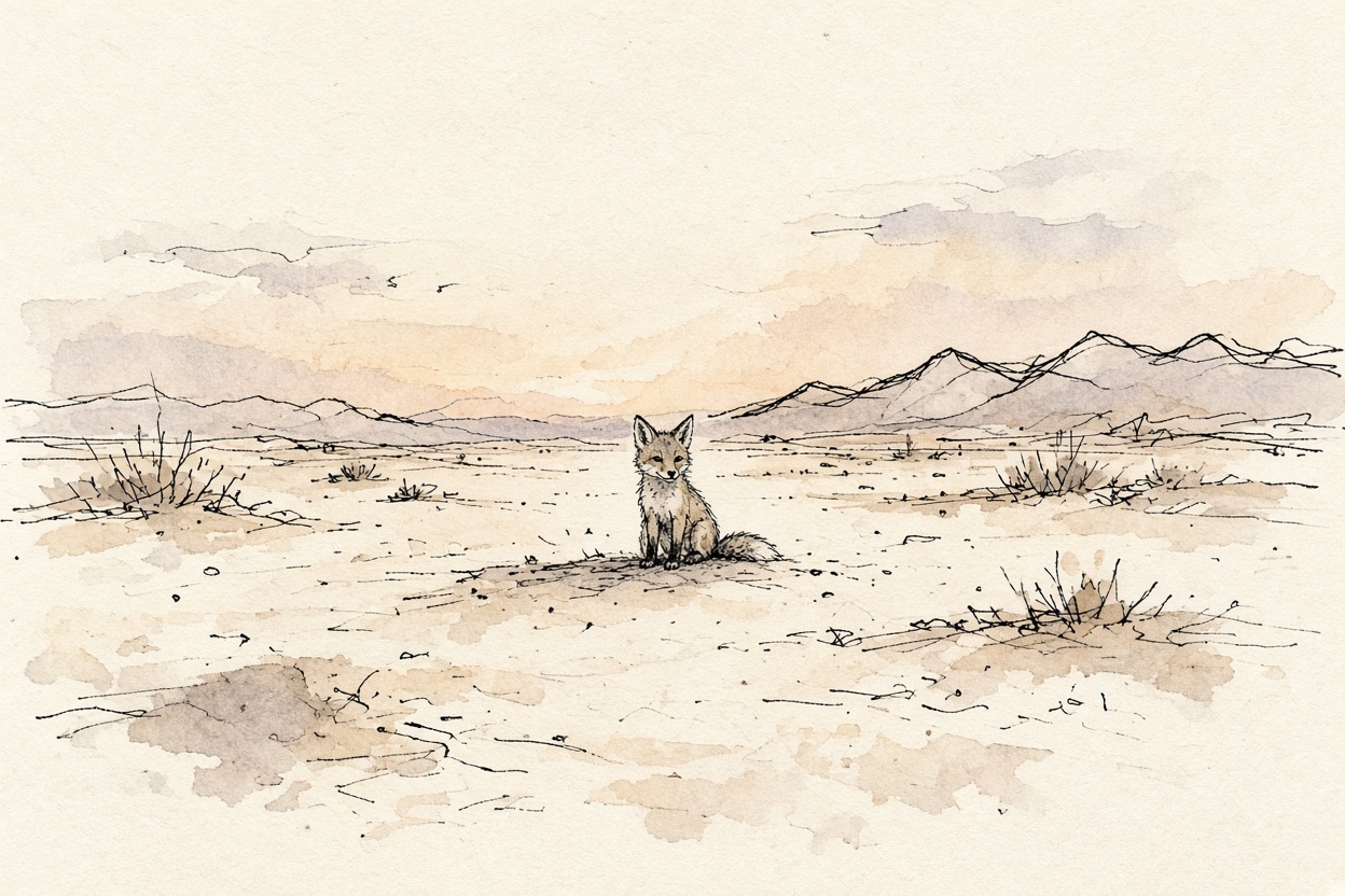
Which brings us to the Vegas Vanguards, the softest name of the lot. Vanguards is a virtue word: courage, pioneering spirit. It's what you name a team when you've run out of ideas about the actual place, which is why the regional flavor all got loaded onto the kit fox and a desert palette of cactus green and desert gold. Even the plural is strange, since a vanguard is already a group. Vegas is one of the loudest cities on earth, visually, and this is the abstraction they landed on.
Women's pro teams don't carry the decades of memory a Red Wings or a Canadiens does, so any new name is going to feel a little arbitrary at first. That's exactly why the specific ones matter more. A name earns its history by being tied to something true on day one. Clutch and Havoc did that. Vanguards punted.
The logos won't even hit the jerseys this first season; the teams wear their city names across the chest while the real branding waits. There's time for these identities to grow on people. Amy Scheer called them "a source of pride and a rallying cry." Two of the four already are. One of them is a word you'd find on a motivational poster.