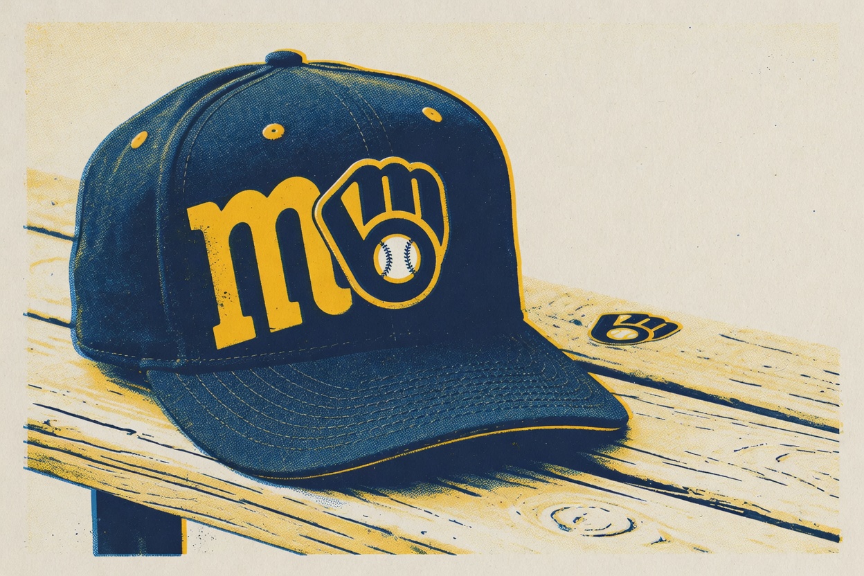
The greatest cap logo baseball has ever produced is the Milwaukee Brewers' ball-in-glove, and it isn't close. The debate is back because the Brewers are back in the World Series for the first time since 1982, which has people staring at that navy cap again and remembering why it rules.
It's an interlocking lowercase "m" and "b" shaped like a baseball glove: the fingers make the M, the palm and thumb make the B, and a white baseball sits in the pocket. The logo tells you the team's name and what the team does in one shape. There's no mascot stuck on a hat, no wordmark doing the heavy lifting. It's a puzzle that pays off the second time you look at it, which is the whole job of a great logo.
The man responsible is Tom Meindel, a 30-year-old University of Wisconsin-Eau Claire art student who submitted one of 1,932 entries in a team contest in the fall of 1977. The franchise was coming off eight straight losing seasons and wanted to ditch its old "Barrelman" look. A fan with a sketchpad beat 1,931 other people and handed the sport its best insignia for a contest prize. It sounds too good to be true, but it's true.
The logo's history makes the case on its own. It debuted in 1978, got abandoned in 1993, reappeared in 2006, and was officially reinstated as the primary logo in 2020. For a quarter-century the people who ran the team chased modern-looking replacements, and for a quarter-century their own fans refused to let it die. When Mark Attanasio bought the club in 2005, he said his number one request from fans was to bring the ball-and-glove back. A front office got overruled on a design question by the people in the stands, over multiple decades, and the people in the stands were completely right. There's no cleaner example anywhere in sports of a fan base's taste crushing a marketing department's.
Minimalists prefer the modern White Sox and Padres marks and call the Brewers love nostalgia in a hat. They're wrong. Clean is easy; anyone can draw a tidy letter. What the glove does is harder: it hides meaning inside the shape and makes you work for the reward. A sleek monogram asks nothing of you. The ball-in-glove asks you to look twice, then makes you feel clever for having looked. It's design beating decoration.
The other contenders are lovely, and none of them do the thing. The Padres' Swinging Friar, a friar in a brown robe swinging a bat, is the most charming logo in the game, but it's just a cartoon. The Athletics' elephant, by the 1950s clutching a bat and balanced on a baseball, has maybe the best origin story in the sport, and it's still an illustration that asks nothing of the viewer. The Angels' lowercase "a" with a halo on the 1971 cap was genuinely beautiful and lasted barely a year before the uppercase version buried it. One good season doesn't make a case.
None of them tuck the team name inside the team's own equipment. Milwaukee drew the best cap logo in baseball by accident, through a fan contest, then spent twenty-seven years trying and failing to improve on it. It's so good the team couldn't quit it.