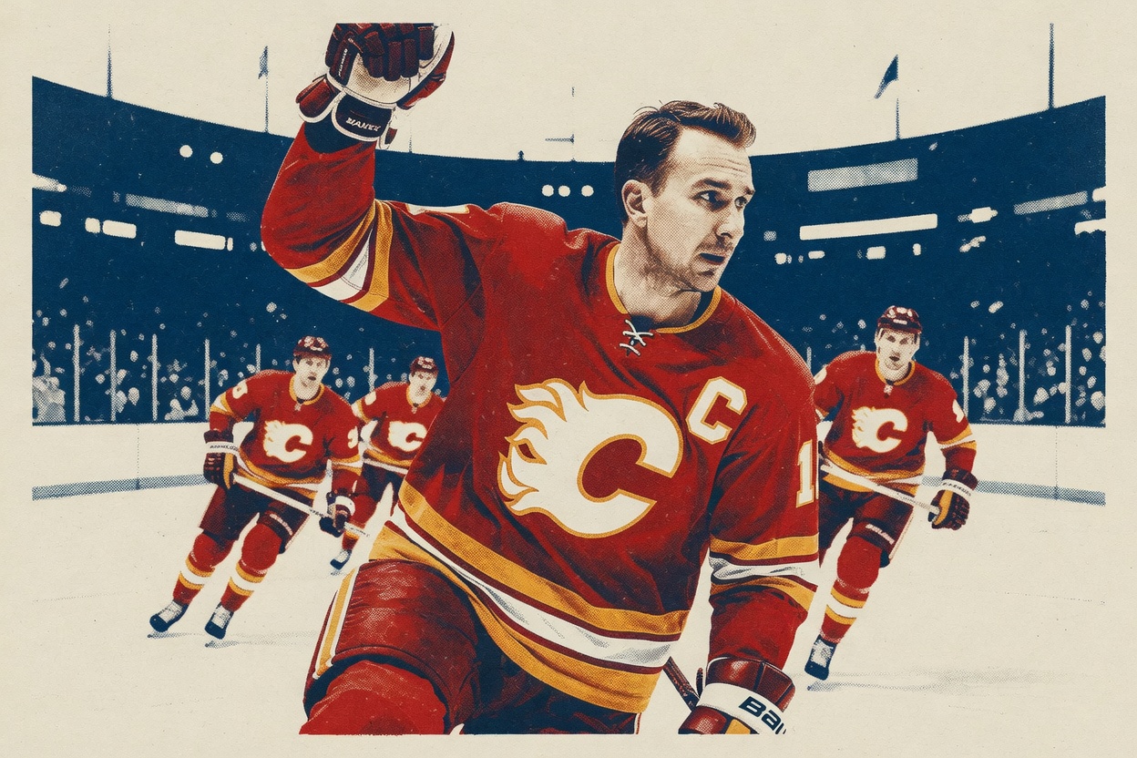
The Jersey Nerds leaked designs for about two-thirds of the league's upcoming Hometown Remix jerseys, going alphabetically from Anaheim down. Icethetics backed up the leak ("great work here! I can corroborate these. not all details align with info I have but generally they're on target"), so the finer details count as solid, if not gospel. What matters is which teams used this as a chance to say something about who they are, and which ones grabbed the nearest piece of nostalgia and called it a day.
Edmonton won. A franchise-first black sweater that still reads instantly as the Oilers, with the royal blue swapped out and orange and grey carrying the whole look, is exactly what a remix should be. New arrangement, same ingredients. The reported design matches what the team has already been skating around in at practice: a logo rebuilt in black, orange and grey, and a cipher that decoded to "OIL COUNTRY AFTER MIDNIGHT." It's a team mining its own identity until it finds a version it's never used, and it works.
Chicago did the same thing and is catching grief for it. Green has deep roots in that market: it's been in the Blackhawks' crest for more than 80 years, in the feathers and in the tomahawk C on the shoulder, and the cipher "THE RIVER SET THE DRESS CODE" ties it to the one day a year Chicago turns its river green. Chasing some other "obvious" color would mean ignoring the team's own logo heritage to chase a tidier story.
And then there's Anaheim, which a lot of people have crowned the best of the bunch. They're wrong, and the reason they love it is the reason it fails. The reported green is the shade from the Mighty Ducks movies, the fictional team's color, with a "FOREVER MIGHTY" cipher to match. The real Ducks wore a different teal on the ice in the '90s. That's a studio's old merchandise pulled off a shelf and stitched onto an NHL sweater. Fans calling it a St. Patrick's Day jersey in Ducks colors aren't being harsh. The licensing math is to blame: nostalgia sells, so they sold it. A hometown jersey is supposed to represent the city, and this one leans on a film instead.
This batch has real hits. Florida going with the league's first pink sweater and a palm-tree-and-stick logo is a swing only Florida could take. Minnesota's dark base with green accents and a "WE OWN THE NIGHT" theme is genuinely sharp. The Islanders dusting off the Fisherman is the kind of chaos that at least has a point of view. Most of the league didn't mail this in; the team getting the loudest praise did, and it did it hardest.
Carolina is the one I'd actually watch. The defending Stanley Cup champions going grey with "Struttin' Stormy" on the front, leaning hard into the NC State overlap Brind'Amour wears on his sleeve, is the boldest regional bet in the group. It's also a tightrope. Hitching a champion's look that closely to a college brand either lands as the most specific thing any team did, or it looks like a team unsure what its own identity is.
Toronto's beige-and-blue vintage Leafs and Pittsburgh's return to "the double blue" are fine. Safe and tasteful, though nowhere near finished in their details. The rollout has barely started: Florida is out first on November 2, and the Leafs don't debut theirs until November 7. Plenty can still change before these hit the ice. But on what we can see right now, the lesson is already written: Edmonton and Chicago remixed themselves, and Anaheim remixed a movie it didn't even make.