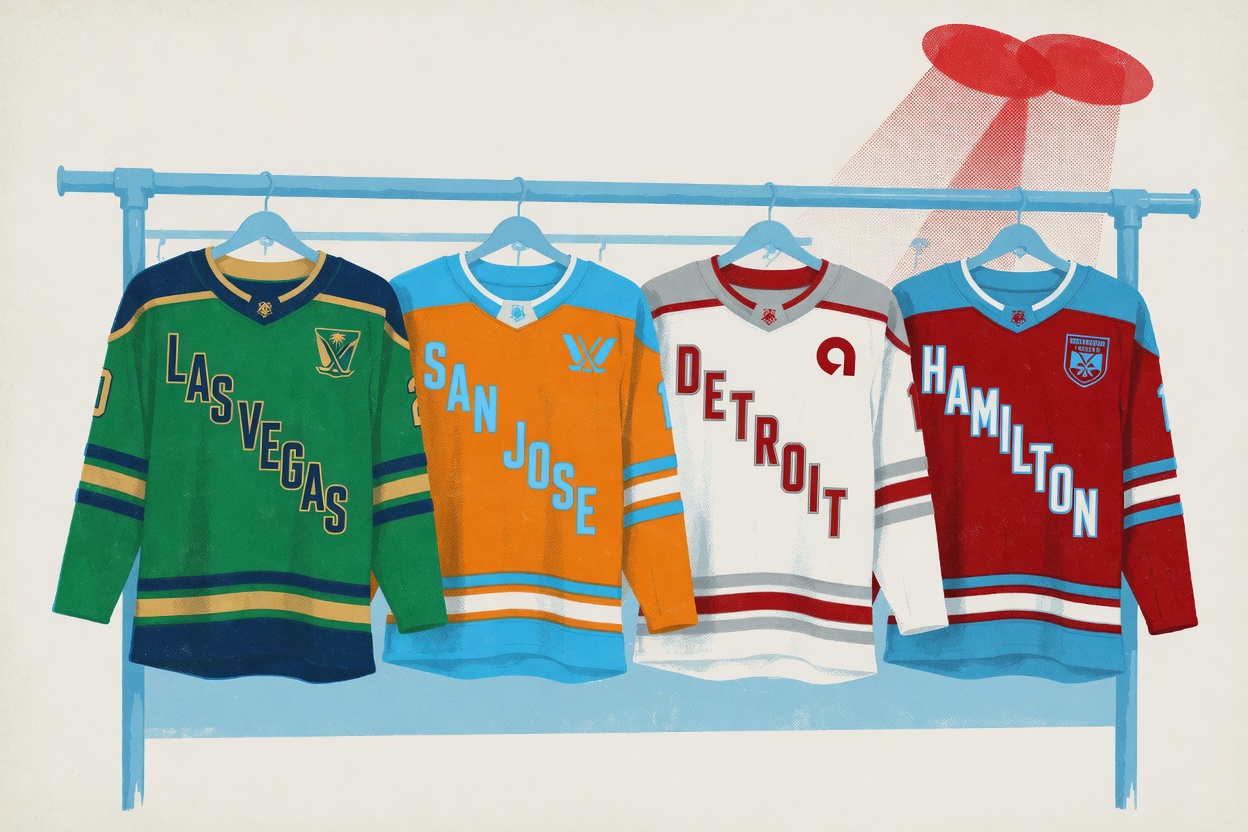
Las Vegas won this, and it isn't close. The PWHL pulled the sheet off home-and-away colorways for its four 2026-27 expansion teams on Thursday. Vegas came out in green, gold and navy, pulled from the scenery of Southern Nevada, with the navy standing in for the desert at night. It looks like a real decision. The kicker: the navy wasn't even in the original plan. It was a late add. Somebody in that room looked at a finished, perfectly safe green-and-gold sheet and decided it needed one more risk, and that instinct is the whole difference between these four teams.
The rest of the slate ranges from genuinely brave to genuinely boring, and the gap is almost entirely about nerve.
San Jose had the second-best idea in the room: mandarin orange as the home base color, sky blue on the accents, a nod to the region's orange groves and the city flag. Bauer had never used mandarin orange as a team's primary color before, and good. A brand-new league trying to carve out space in crowded markets should hand out jerseys you can spot across a bar. Orange does that. It's loud, it's regional. You'll know a San Jose sweater when it skates past you.
Then there's Detroit, and I'm sorry, but white, silver and red stripes built as a callback to the 313 area code is the kind of concept that sounds clever in a deck and lands as nothing on fabric. Red gets explained as a nod to Hockeytown's century-plus of hockey in the United States, which is a lovely sentence and a thin jersey. When your most distinctive feature is the Ally Financial patch, the design has already lost. Detroit got handed the richest hockey identity of any of these four markets and answered with the most forgettable sweater. Self-inflicted wound.
Hamilton rounds out the four. These are only colorway reveals, not full kits, so the final judgment waits until the city shows what it's actually building toward.
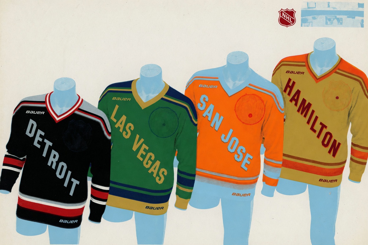
None of these are finished. The league was explicit about that. For the first season every team wears a generic market jersey with the city name running diagonally across the chest, and the real identities, team names and logos, arrive before the 2026-27 season and only hit the uniforms in 2027-28. So yes, a logo could rescue Detroit and a bad crest could sink Vegas. The colorways could read completely differently once there's a name stitched over them.
But color is the foundation here, and the league chose to reveal exactly that and ask us to react to it. On those terms, the teams that committed to a color look alive, and the one that hedged looks asleep. The identical diagonal city-name treatment across all four doesn't help anyone. It flattens the reveal into four variations of the same template, which only makes the palette choices carry more weight. Vegas and San Jose carried that weight. Detroit set it down.
All four debut on Opening Weekend, December 5 and 6. When they skate out, Vegas will be the one turning heads. Detroit will be the one still buried under its own history.