The jerseys are good. The plan around them is bad, and that's on the PWHL.
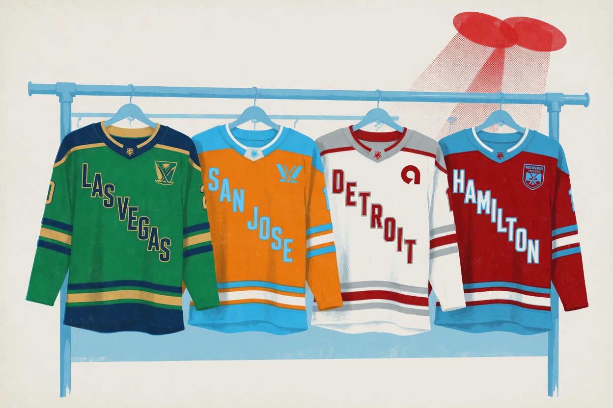
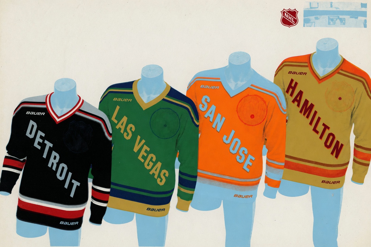
On Thursday the league unveiled home and away sweaters for its four 2026-27 expansion teams in Detroit, Hamilton, Las Vegas and San Jose, ahead of Opening Weekend on Dec. 5-6. The clothes themselves are the most interesting work the PWHL has produced. For a league still finding its visual identity, this is a real step. Hamilton's gold with burnt orange and deep red, a nod to the Tiger-Cats and the city's steel history, has a genuine identity. San Jose's mandarin orange with sky blue, pulled from the region's orange groves and the city flag, is loud in the best way. Detroit's black and silver with red accents reads as restrained next to those two, but the full uniform is sharp, and red is the right call for a market that's been carrying hockey in the States for a long time.
So the design question mostly answers itself. Bauer did the job. The problem is what's printed on the chest: nothing. Each sweater carries only the city name stitched diagonally across the front. No team name, no logo. The league says all four identities, names and logos included, will come before the season begins, but won't actually appear on the uniforms until 2027-28. You'll watch these teams play an entire first season as DETROIT, HAMILTON, LAS VEGAS and SAN JOSE, full stop.
The defense is that this is just how the PWHL does it. The first eight teams all debuted in diagonal city wordmarks. The NHL's Utah club skated a full season without a name or logo too, and the league has leaned on that as cover. Fine. That was the move when you were standing up six franchises overnight and everything was on fire at once.
These are expansion teams added deliberately, on a timeline the league set itself, with months of runway. There's no emergency here. The league knew these four were coming well in advance and still chose to send them out onto the ice as placeholders in their single most important season, the one where a new market decides whether it cares. You only get one inaugural night in Las Vegas or San Jose, and the fans who show up can't buy a jersey with their team's name on it because the team doesn't have one yet. That's a choice the league made on its own.
The league has already shown it can move faster. Last cycle, Seattle and Vancouver had their names and logos, the Torrent and the Goldeneyes, out before they took the ice against each other on Nov. 21. The machinery exists; the league just didn't point it at the expansion group this time.
None of this is the designers' fault, and the color work deserves better than the asterisk it's getting. The late tweaks on Vegas, where navy got added to the green and gold to evoke the desert at night, suggest people were still sweating these details right up to the unveil. Somebody cared, which makes the empty chest even more frustrating. You can feel the effort in the palette and then run straight into a blank space where the team should be.
The artists earned something better than this rollout. The PWHL built four teams worth cheering for and then refused to tell anyone who they are.